
Mirror
Responsive eCommerce website for a fictional enterprise

Project Overview
Tools
Figma, Adobe Illustrator, InVision, OptimalSort, Pencil & PaperRole
UX Designer (Research, Visual Design, Interaction Design, User Testing). Team
Self Directed with feedback from peers and mentorDuration
8 Weeks
The Background
Fictional company, Mirror is a successful global retail chain with over 400 stores worldwide and 25 years in the industry. Mirror prides itself on keeping cost low and providing solutions for customers.
The Problem
After much success offline, seeing commercial viability and customer request, Mirror is ready to expand their presence in the digital market with a new modernized website.
The Solution
To build a responsive website and develop an online brand identity.
Design a responsive e-commerce website that is easy to use and allows customers to browse through all products and utilize filters.
Develop Mirror’s digital brand identity and design a logo that is modern and neutral.

Conducted Research to Gain a Better Understanding of Mirror’s Users
Research Plan
Research allows us to first understand what I know, what I don’t know, and what I need to find out. It also enables me to dive deep into our understanding of our users, not just their immediate frustrations, but their views, behaviors, fears, limitations, reasoning, and goals as well.
To ensure research stays on track, I assembled a research plan prior to conducting research to help guide and develop a well structure research execution. I outlined research goals, research questions, assumptions, methodologies, participants, and timeline in my research plan.
Research Goals
Understand the e-commerce market landscape.
Identify target users.
Identify user’s goals, motivations, behavior, experience, and frustrations when shopping online.
Uncover who our competitors are and understand their solutions for target audience.
Research Methodologies
Secondary Research (Market Research, Competitive Analysis)
Primary Research (User Interview)
Secondary Research
Market Research
To better understand the dynamic of the retail industry, I must first familiarize myself with the latest global retail market landscape. I research online retail shopping trends, shopping habits, online shopper demographics, frustrations, and gather the latest insights from analytical reports, statistics, and case studies. This information assisted me in validating and invalidating assumptions I had about users and their expectations retail shopping online.
Demographics
Millennials aged 25-35 were the largest online shoppers in the U.S., accounting for over at 20% of digital buyers. -statistic.com
Second-largest online buyer are ages 35-44, accounting for 17% of U.S. digital buyers. -statistic.com
68% of men shop online (40% retail) and 72% of women shop online (46% retail). -sapio research
Shopping Habits
62% of online shoppers shop at least once a month. 26% of online shoppers shop once a week. -episerver
77% of consumers say discounts influence where they shop. -forbes
48% say discount speed up their decision making. -forbes
Cart Abandonment
49% of cart abandonments are due to high extra costs (shipping, taxes, fees) - Baymard
Average large-sized e-commerce site can gain a 35.26% increase in conversion rate though better checkout design (translate to $260 billion worth of lost orders). -Baymard
Competitive Analysis
Next, I identified Mirror’s direct and indirect market competitors to understand their strengths, weaknesses and success and failures to solving problems regarding their products and services. These findings will be beneficial in uncovering gaps in the market to figure out where and how to position Mirror as a brand. I analyzed 3 direct competitors with the same goal of trying to solve similar problems as Mirror and 2 indirect competitors that only solve one aspect of the problem.

Primary Research
After building a general understanding of the market, my next step is to build real connections with our users. To do so, I conducted one-on-one user interview with the goal of learning more about their motivations, needs & wants, pain points and behavior directly by encouraging participants to share their experiences and stories.
User Interview Summary (Interview Guide)
4 participants were interviewed about their past experience shopping on e-commerce websites and in-stores
2 Females 2 Males
Ages 26-34
List of 8 interview questions based on open-ended questions
Interview Duration: 15-20 minutes
Virtual through Zoom
Research Synthesis
To synthesize the qualitative data gathered from my user interview, an empathy map was created to understand our users by identifying patterns, uncovering insights and generating needs. View larger version of empath map.

Needs
Insights
Clothing sizes to be accurate
Variety (size, color and style)
Shopping to not be a task when searching for products
Participants don’t feel confident shopping online due to sizing inaccuracy
Participants are motivated to shop when there is a sale/promotion
Participants reference reviews for product insight and feedback
User Persona
Based on the data synthesized from our user interview, a user persona was created. I created Christina as my persona to create reliable and realistic representations of the key user’s goals and characteristics. It will also help focus on the major problems and address the critical needs of the user group.

Storyboard
To take a step further from our persona, I created a storyboard that shows my persona (Christina) experiencing the problem space that we are interested in and how product solves the her frustrations. This will keep us in a human-centered mindset.

Transform data gathered from research into knowledge, insights and needs
Project Goals
User goals are of the utmost importance, however the desirability of the product must be balanced with business goals and technical considerations. Project goals enable us to have a clear overview of the product, pave the way for determining product features and make the proper decisions.
I summarized user goals based on my persona and empathy map, assembled business goals referencing the project brief, took technical goals into consideration, and visualized project goals.

POV Statements & How Might We Questions
With insights and needs derived from my empathy map, we created a “Point of View” Statement and “How Might We” questions to reframe known challenges to create innovative solutions.

Feature Roadmap
Having identified user and stakeholder goals and gained an understanding of what competitors offered, I then created a list of features to be included in our MVP. This will provide a clear overview of the features for the product including their prioritization for development. The feature roadmap list out Must Have (P1), Nice To Have (P2), Surprising and Delightful (P3) and Can Come Later (P4). These priorities are categorized based on the business and user’s needs.

Card Sorting
To create a successful information architecture for Mirror, an open card sort was conducted in order to gain insight regarding how users understand & categorize information. This similarity matrix identified strong pairings, potential groupings, and common patterns in organization.

Site Map
Utilizing my findings from the card sorting exercise, feature roadmap and project goals, I was able to assemble a sitemap that demonstrates the hierarchical structure that includes our proposed pages and features for Mirror’s website. View Site Map.


To achieve the best possible solution by brainstorming all possible solutions
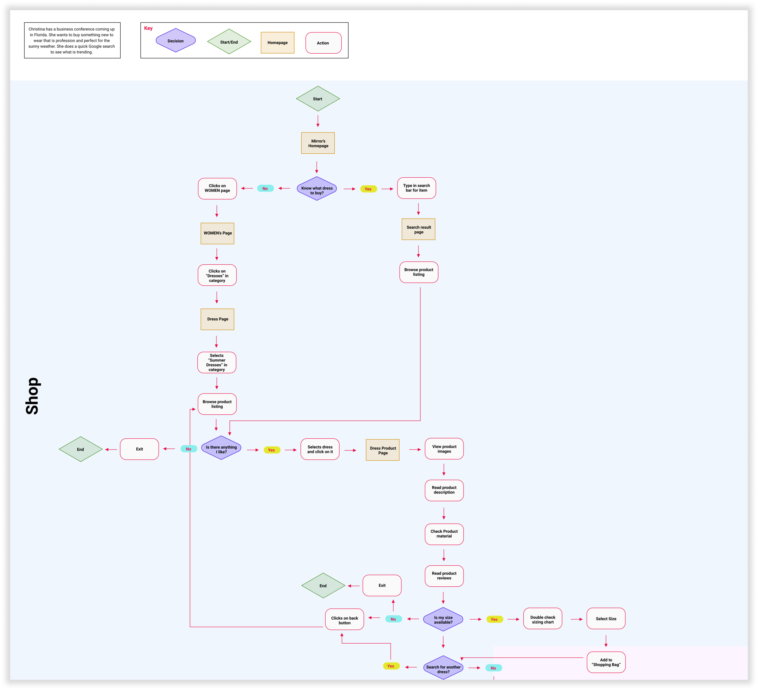
Task Flow
Before constructing the website, I must first understand the needs of my users and the series of actions the user will need to take in order to achieve their goal. Below I have defined three key task that Christina would like to complete and demonstrated steps she will need to take to accomplish the three task.

User Flow
Taking the task flow one step further, I created a user flow to better understand how users could interact with the website. It outlines all possible scenarios, options, errors, dependencies, and outcomes. The below user flow maps out Christina’s three task and how she can be moving through the website to accomplish her goals.
UI Requirements
After identifying the key screens, I created a UI Requirement document referencing the sitemap, user flow and task flow. I made a list of detailed tactical elements that is essential and facilitates needs for the user to complete their task. This document will further assist me in the wire framing process. The document is categorized by high-level, meta-level, and detailed requirements.
Wireframes
Wireframes operates as the architectural blue print used to represent underlying skeletal framework of Mirror’s interface. This is constructed base on the UI Requirement document.
Sketches
Before digitalizing Mirror’s framework, I first captured my ideas on paper. This will enable us to examine and convey our ideas, demonstrate functionality, visualize flow, and illustrate interaction. Sketching will discover potential issues and solutions early.

Lo-Fi and Responsive Wireframes
Once I decided the visual direction of the layout I want to go for, I started to digitalize a mid-fidelity version of the wireframe. This is a quick and easy way to translate high-level design concepts into tangible and testable artifacts. Most importantly, it allows me to check and test functionality early on.

Branding
Before diving into the visuals and logo, I created a Mood Board using Pinterest to gather inspiration that best represents Mirror’s brand attributes: Modern, Fresh, Natural, and Minimalistic.
Logo Design
A logo is essential to further establish Mirror’s brand identity. Before digitalizing, I brainstormed ideas and concepts and sketched ideas on paper ensuring brand attributes are incorporated. I then selected my top four to be digitalize. Before selecting my final concept, I ensured logo is legible and responsive.

Style Guide
To continue developing the visual style of Mirror, I created a style guide. The style tile serves as a synthesizing document that describes and demonstrates Mirror’s brand standard that includes the logo design, typography, color palette, and imagery that serves as a guide for the UI design.

View Style Guide
Responsive UI
After establishing Mirror’s visuals and framework, it was time to bring the website to life. I created the responsive UI by incorporating Mirror’s established elements.

UI Kit
UI Kit serves as a living document that describe and show examples of what the site is suppose to look like, how to use it, and serve as a standard guide for future implementations and designs.


Created high fidelity representation of prototype to be tested
Desktop Prototype
In the Prototype phase, I built a scaled-down version of the product to test usability and feasibility of our interaction. This will help reduce user friction, eliminate errors, and uncover mistakes and false assumptions.
I used Figma and InVision to create the prototype for the pages needed to be evaluated within the focus area.
Task includes:
Task 1: Find the white floral Leah Dress
Task 2: Find your size for the Leah Dress using the “Find My Size” option in the size chart
Task 3: Add the Leah Dress to the shopping chart
Usability Testing
Prepare for Usability Testing
Next we brought the mock prototype to be tested for users to interact with. In this process, I studied how users responded and interacted with the prototype. I gathered insights from our usability testing, evaluate them, revise and re-test.
Prior to conducting, a structured usability test plan was assembled in order to stay on track and retain consistency.
Objectives, methodologies, task, scenarios, and transcript was put together to serve as a rubric during the initial testing.
Conduct Usability Testing
I then conducted both in-person and remote usability testing with 7 participants. A transcript was created for each participant based on the voice recordings and on my observation of their interaction with the prototype. I noted their mistakes, slips, and confusions they expressed in the process. This transcript will help summarize the patterns of user’s interaction with the prototype. View Transcripts
Affinity Map
The results from the usability testing was summarized by creating an affinity map. Feedback is organized into different categories. It is effective in identifying patterns and frustrations that users has when interacting with the prototype uncovering areas of improvement based on priority levels.
Each participant was assigned a different color sticky note. Each note capturing their highlighted feedback and then categorized patterns by observations and frustrations.

View Full Affinity Map
Recommendation
Insights
Have floral color option pre-selected and clearly indicate color of item being shown/modeled when users land on the product page.
4/7 participants did not select a color for the product before adding item to bag assuming the product being modeled in the image were pre-selected
Priority Revisions
The time and resources I have is limited, I made revisions based on the priority matrix notated.
My primary revision is having the color of the product pre-selected that is modeled. I updated prototype so color will be automatically selected as soon as users land on the product page. Users have overlooked and were confused as to why the color were not pre-selected prior which led them to clicking the inactive art button when attempting to add item to their shopping chart.


Design Implementation & Handoff
Since the design has been tested and priority revisions have been implemented, it is ready to enter the development phase. We will use collaboration tools to handoff the work to developers and assist with any follow-up questions.
Maintenance
Although testing is the final phase of the design thinking process, the iterative process does not end here. Updates and revisions will continue to exist in the future, and will be addressed based on the priority levels.